A sophisticated gallery wall is not about following rigid rules; it’s about mastering the art of personal curation.
- Intentional Curation: The key is to treat your collection as a visual autobiography, where every piece and frame has a purpose.
- Damage-Free Execution: Success lies in understanding the science of your walls, from paint cure times to the correct hanging hardware.
Recommendation: Begin by planning your layout on paper, not on the wall, to perfect your composition before a single nail is hammered.
The desire to surround ourselves with memories, art, and inspiration is a powerful one. You’ve collected the prints from travels, the family photographs that spark joy, and the art that speaks to you. Yet, they remain in a stack, leaning against a wall. The fear is palpable: the fear of the misplaced nail, the ripped paint, the final result looking more like a chaotic jumble than a curated collection. This hesitation transforms a blank wall from a canvas of possibility into a source of anxiety.
Common advice often revolves around a few core tenets: plan the layout on the floor, choose a central piece, and maintain consistent spacing. While practical, this advice treats the process as a mere mechanical assembly. It overlooks the most crucial element: the story you want to tell. A truly captivating gallery wall is more than just decoration; it’s a visual autobiography, a dynamic installation that reflects your life, your taste, and your evolution. It requires the mindset of a curator, not just a decorator.
But what if the secret to a gallery wall that feels both personal and polished isn’t found in simply following rules, but in understanding the curatorial intent *behind* them? This guide will shift your perspective. We will move beyond the platitudes to explore the nuanced decisions that create compositional harmony. We will delve into the structural integrity of hanging methods to ensure your story is told on a flawless canvas. You will learn not just how to hang pictures, but how to install a collection with the precision and confidence of a seasoned art curator.
This article provides a complete framework for that process. From establishing the perfect viewing height to selecting the right insurance for your most valuable pieces, each section is designed to empower you with the knowledge to create a gallery wall that is intentional, beautiful, and free from the regret of a misplaced hole.
Summary: The Curator’s Guide to a Flawless Gallery Wall
- Why Eye-Level Is Lower Than You Think (57 Inches Rule)?
- Matching vs Mismatched Frames: Which Suits Your Room Style?
- Abstract vs Landscape: Which Reduces Stress in a Home Office?
- The Mounting Tape Mistake That Rips Drywall Paper
- Planning the Layout: The Paper Template Method Before Hammering
- The Command Strip Mistake That Rips Paint Off the Wall
- Why Your Homeowners Policy Won’t Cover Your Engagement Ring?
- How to Insure High-Value Personal Assets Correctly?
Why Eye-Level Is Lower Than You Think (57 Inches Rule)?
The most foundational principle in art installation is not an arbitrary number, but a philosophy of connection. The “57-inch rule” dictates that the center of a single artwork or an entire gallery wall should be positioned 57 inches from the floor. This isn’t just a designer’s whim; it’s the average human eye level, the standard used by museums and galleries worldwide to create an immediate and comfortable visual relationship between the viewer and the art. By adopting this as your starting point, you are applying a professional curatorial standard to your own space.
However, a home is not a museum. The true art of curation lies in knowing when to adapt the rule to the function of the space. The goal is to optimize the viewing experience for how the room is actually used. For instance, when hanging art above a sofa or console table, the rule still applies, but with a crucial modification: ensure there is a gap of 6 to 8 inches between the top of the furniture and the bottom of the lowest frame. This creates a cohesive visual unit rather than two disconnected elements.
A compelling case study from Crate & Barrel’s design team demonstrates this adaptability. In living rooms, the standard 57-inch center point created the desired connection. However, for a dining room where viewers are primarily seated, they lowered the center to 52 inches. For a home office, a height of 54 inches was found to reduce neck strain. As their findings show, thoughtfully breaking the rule based on context is the mark of a skilled curator. The 57-inch rule is your anchor, not your cage.
Matching vs Mismatched Frames: Which Suits Your Room Style?
The frames you choose are the narrative voice of your gallery wall. They do more than simply hold the art; they establish the rhythm, tone, and personality of the entire composition. The choice between a uniform set of matching frames and an eclectic mix is a defining curatorial decision that should be driven by the atmosphere you wish to create, not by passing trends. A wall of identical frames lends a sense of order, formality, and cohesion, making it a perfect choice for minimalist, modern, or traditional spaces. The art itself becomes the sole variable, creating a clean, gallery-like effect.
Conversely, mismatched frames tell a story of a collection gathered over time. This approach offers immense personality but requires a careful hand to avoid visual chaos. A successful eclectic wall relies on a “unifying element” to tie the disparate pieces together. This could be a consistent color (e.g., all black frames in different styles), a repeating material (e.g., a mix of woods), or a uniform mat color throughout. This creates what designers call a “frame family”—a curated group that feels related, not random.
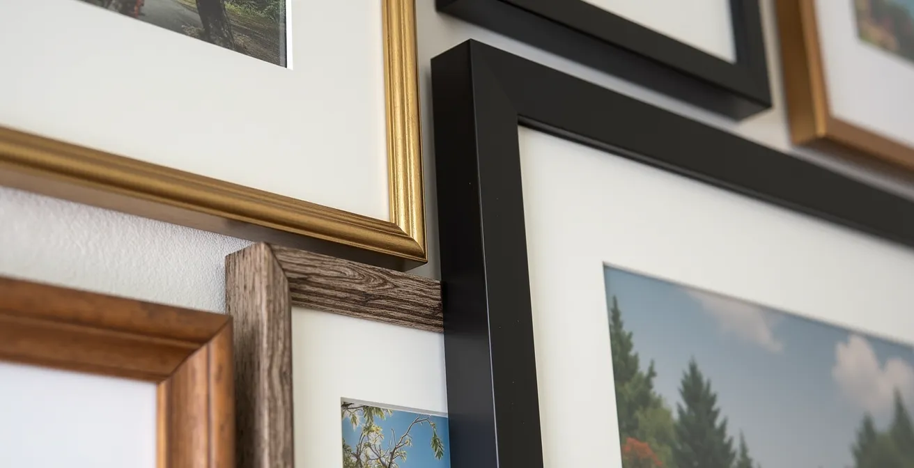
This detailed photograph highlights the tactile beauty of combining different frame materials. Notice the interplay of textures between natural wood grain, brushed metal, and matte finishes, a key technique in creating a sophisticated, collected-over-time aesthetic.
The following table, inspired by design principles from experts like Emily Henderson, breaks down the aesthetic impact of each approach. Use it as a guide to determine which framing strategy will best articulate your room’s story.
This decision is central to your curatorial intent, as it dictates the overall feeling of the wall, from formal and serene to dynamic and personal. The choice is less about right or wrong and more about aligning the execution with your vision. The following comparative analysis of frame styles provides an excellent framework for making this decision.
| Frame Style | Visual Effect | Best Room Style | Maintenance of Cohesion |
|---|---|---|---|
| All Matching Frames | Clean, organized, formal | Minimalist, Modern, Traditional | Relies on varied art content for interest |
| Mixed Frames (Same Color) | Eclectic yet unified | Transitional, Bohemian | Color creates continuity; shape variety adds dynamism |
| Completely Mixed | Collected-over-time feel | Eclectic, Vintage, Maximalist | Requires consistent spacing and deliberate arrangement |
| Frame Families (2-3 styles) | Curated, sophisticated | Contemporary, Scandinavian | Rhythmic repetition prevents chaos |
As celebrated designer Emily Henderson notes, the strategy is everything when mixing styles:
The key to mixing frames successfully is finding your unifying element – whether that’s a consistent mat color, a repeated frame material, or maintaining the same spacing throughout. Without that thread of continuity, even the most beautiful pieces can look haphazard.
– Emily Henderson, Emily Henderson Design Blog – Gallery Wall Formula
Abstract vs Landscape: Which Reduces Stress in a Home Office?
The art in your home office is not passive decoration; it is an active environmental factor that can influence your mood, focus, and productivity. When curating a gallery wall for a workspace, the primary consideration should shift from purely aesthetic to functional and psychological. The debate between abstract art and landscapes is central to this. Your choice can either create a source of calming inspiration or an unintended distraction.
Scientific studies on biophilia—our innate tendency to connect with nature—suggest that landscapes and nature-inspired art can have a restorative effect, reducing stress and mental fatigue. A serene coastal scene or a lush forest path can act as a “micro-break” for the eyes, offering a moment of escape. However, highly detailed or personal pieces, like a bustling city-scape or a family photo, can pull focus and interrupt deep work if placed in your direct line of sight. The emotional resonance of these pieces is powerful, but must be managed.
Abstract art, particularly pieces with low detail and fractal patterns (the repeating patterns found in nature), can offer the best of both worlds. They provide visual interest without demanding narrative interpretation, which helps reduce cognitive load. A large, calming abstract piece can set a sophisticated tone without competing for your attention. The key is strategic placement. A curator’s approach would be to place highly engaging, detailed art in your peripheral vision and calming, low-detail abstracts directly in your sightline for periods of focused work. This creates a balanced environment that supports both emotional connection and professional concentration.
The Mounting Tape Mistake That Rips Drywall Paper
The greatest fear for any homeowner planning a gallery wall is permanent damage to their “canvas”—the wall itself. Adhesive strips are often marketed as the perfect damage-free solution, but their misuse is a primary cause of ripped paint and torn drywall paper. The most common mistake is not the strip itself, but a failure to understand the conditions required for its success. Adhesive strips are highly sensitive to three factors: paint cure time, wall texture, and humidity.
A detailed analysis of mounting failures reveals a critical insight: a majority of damage occurs on walls with paint that is less than 30 days old. Fresh paint needs time to fully cure and bond with the drywall; applying and removing an adhesive strip prematurely will lift the paint layer. Similarly, these strips are designed for smooth, flat surfaces. On textured walls, like those with “orange peel” or “knockdown” finishes, the strip cannot achieve full adhesion, leading to failure. For these situations, small picture-hanging nails are often a safer, more reliable choice, as they create a tiny, easily-repaired hole.
This image demonstrates the correct, patient technique for removing an adhesive strip. The key is to pull slowly and parallel to the wall, a simple gesture that prevents the force from pulling the paint away with the strip.

To avoid costly repairs, adopt a curator’s mindset of material assessment. Before committing your entire collection to one method, test your chosen hardware in an inconspicuous area, like behind a door or piece of furniture. A “test patch” protocol—applying a strip and leaving it for a week—can save you from widespread damage. For heavy frames (over 10 lbs), always default to proper drywall anchors, as no adhesive is a substitute for a secure mechanical bond.
Planning the Layout: The Paper Template Method Before Hammering
A masterful composition is never an accident. Before a single instrument is played in an orchestra, the conductor has the entire score mapped out. Similarly, before a single nail is hammered, a home curator must have their entire composition planned. The most effective and risk-free way to achieve this is the paper template method. This technique transforms the daunting task of layout into a creative and adjustable process, eliminating guesswork and ensuring a perfect result on the first try.
The method is simple yet profound: trace each of your frames onto kraft paper or old wrapping paper. Cut out the templates and mark the exact spot for the nail or hanger on each one. Then, using painter’s tape, arrange these paper templates on your wall. This is your rehearsal. You can live with the layout for a few days, viewing it in different light and from different angles. You will immediately see if the spacing is too tight, if the balance is off, or if the overall shape complements the room. A successful project showed that this method reduced installation time from 5 hours of trial-and-error to a flawless 2-hour process, as documented in a compelling home renovation case study.
The standard curatorial guideline is to maintain a consistent 2-3 inch gap between frames to allow each piece to breathe while creating a cohesive group. The paper templates make achieving this consistency effortless. For those more digitally inclined, tools like PowerPoint or Canva can serve the same purpose. Create a scaled rectangle of your wall, import images of your art, and arrange them digitally before translating the final layout to the wall with a measuring tape.
Your Pre-Installation Curatorial Checklist: From Vision to Wall
- Points of Contact: List all art pieces, photos, and objects intended for the wall. Note their dimensions, including frames.
- Collecte: Trace each frame onto kraft paper to create a full-scale template. Mark the exact hanging point on each template.
- Cohérence: Arrange the paper templates on the wall. Confront the layout with your room’s style and the narrative you want to convey. Does it feel balanced? Cohesive?
- Mémorabilité/émotion: Step back. Does the composition have a focal point? Does it create an emotional response or just fill space? Adjust until it feels right.
- Plan d’intégration: Once satisfied, hammer the nail directly through the marked spot on each paper template. Remove the paper, and hang your art perfectly.
The Command Strip Mistake That Rips Paint Off the Wall
The promise of Command Strips is seductive: strong hold, clean removal. Yet, a trail of damaged walls tells a different story. The failure is rarely the product’s fault, but rather a misunderstanding of the material science at play. The single most critical factor for successful use and removal is allowing for adequate paint cure time. While paint may feel dry to the touch in hours, it is not fully cured. The curing process, where the paint hardens and adheres completely to the substrate, is a chemical reaction that takes time. According to professional installers, walls require 7 to 30 days for paint to fully cure.
Applying an adhesive strip to uncured paint creates a bond with a weak, unstable surface. When you remove the strip, you are not just pulling on the strip; you are pulling on the top layer of paint that has not yet fused with the layers beneath it, guaranteeing that it will peel away. This is the cardinal sin of adhesive hanging. Patience is the ultimate tool for damage prevention.
The second critical error occurs during removal. The instructions are explicit for a reason: you must pull the tab slowly and parallel to the wall, never outwards. Pulling the strip away from the wall at an angle concentrates all the force on a small area of the paint’s surface, acting like a lever to pry it off. Stretching the tab parallel to the wall, however, elongates and releases the adhesive’s bond without stressing the paint. If you encounter resistance, stop. A gentle blast of heat from a hairdryer on a low setting for 30 seconds can soften the adhesive, making removal much smoother. Treating removal with the same care as installation is essential for preserving the integrity of your walls.
Why Your Homeowners Policy Won’t Cover Your Engagement Ring?
As your gallery wall evolves from a few decorative prints into a meaningful collection of original art or limited editions, its nature changes. It becomes more than just decor; it becomes an asset. This is where a dangerous gap in financial protection often appears, much like the insufficient coverage many homeowners have for valuables like an engagement ring. A standard homeowners insurance policy is designed to cover general contents, but it places strict, low limits on specific categories of valuable items, including jewelry, firearms, and, crucially, fine art. Typically, this limit is a mere $1,000 to $2,500 for your entire art collection.
Imagine a small leak from an upstairs pipe ruins three of your favorite prints. You might assume your insurance will cover their replacement cost. However, if your policy’s art limit is $2,500 and the appraised value of your collection is $10,000, you will only be reimbursed for a fraction of your loss. Furthermore, standard policies often pay out on a “depreciated value” basis, not the full amount you would need to replace the piece today.
A striking case study illustrates this risk perfectly. A collector’s growing gallery wall, valued at $12,000, far exceeded their policy’s $2,500 art limit. By adding a “Personal Articles Floater” specifically for their art, they ensured full coverage. When water damage occurred, this specialized policy paid the full, appraised replacement value, not the depreciated value. The lesson is clear: as your collection’s value grows, your insurance coverage must evolve with it. The first step is to create a detailed inventory, documenting each piece’s artist, title, purchase price, and provenance. This is not just good practice; it’s essential financial stewardship for the curator of a valuable collection.
Building Your Art Collection’s Insurance Inventory
- Photograph each artwork individually, both in and out of its frame, with clear lighting.
- Document the provenance: artist name, title, medium, dimensions, purchase date, and price paid.
- Store digital copies of all purchase receipts, invoices, and any certificates of authenticity in a secure cloud folder.
- Create a spreadsheet to track the total value of your collection, updating it whenever you acquire a new piece.
- Obtain a professional appraisal for any individual piece valued over $1,000, as this documentation is crucial for proper coverage.
Key takeaways
- Curatorial Intent is Key: A successful gallery wall tells a personal story, not just fills a space. Your choices in art, frames, and layout should serve a unified narrative.
- Master the Rules to Break Them: Principles like the 57-inch rule are professional starting points, not rigid commands. Adapt them to the function and feel of your unique space.
- Protect Your Canvas: The greatest risk is wall damage. Understand the science of paint curing and the correct use of hanging hardware to ensure a flawless, regret-free installation.
How to Insure High-Value Personal Assets Correctly?
Once you recognize your gallery wall as a significant asset, the next logical step is to secure it with the correct financial instrument. Relying on a standard homeowners policy for a valuable art collection is akin to storing a masterpiece in a garden shed—it’s simply inadequate for the risk. A home curator must understand the different types of coverage available to make an informed decision that protects their investment. Moving beyond your basic policy is not an upsell; it’s a fundamental aspect of responsible collection management.
The options can seem complex, but they generally fall into a few clear categories, each designed for a different level of collector. For a handful of valuable pieces, a “Scheduled Personal Property” endorsement allows you to list (or “schedule”) each item individually with its appraised value. For a larger, growing collection, a “Fine Arts Floater” provides more flexible, blanket coverage for the entire collection up to a total agreed-upon amount. This is often the most efficient option for active collectors.
The following table provides a clear comparison of these options, helping you identify which level of protection aligns with the current state of your collection. An investment of a small percentage of your collection’s value in the right policy provides immense peace of mind and financial security.
Navigating these choices is essential for any serious collector. This breakdown of art insurance options offers a clear path toward securing your assets properly.
| Coverage Type | What It Covers | Typical Cost | Best For |
|---|---|---|---|
| Standard Homeowners | Up to $1,000-2,500 for all art | Included in policy | Decorative prints, posters |
| Scheduled Personal Property | Specific items listed individually | $30-60 per $1,000 value/year | Individual valuable pieces |
| Fine Arts Floater | Blanket coverage for collection | $100-300 per $10,000 value/year | Growing art collections |
| Agreed Value Policy | Pre-agreed amount per piece | 1-2% of collection value/year | Original art, signed editions |
Ultimately, insuring your art is the final act of curation. It acknowledges the time, passion, and financial resources you’ve invested. As one professional advisor eloquently puts it:
Your gallery wall isn’t just decoration – it’s an investment in your personal story. Protecting it properly honors both the artists’ work and your curatorial vision.
– Professional Art Insurance Advisor, RiversWallArt Gallery Wall Design Guide
You now possess the mindset and the methodology of a home curator. The next step is to move from theory to practice. Begin by inventorying your collection, not just as a list of items, but as the chapter titles of your visual autobiography, and start planning your composition with the confidence that you can execute it flawlessly and protect it wisely.