Successfully integrating global textiles is an act of cultural curation, not just decoration.
- Authenticity and provenance are more critical than pattern matching; understanding a textile’s story prevents unintentional disrespect.
- A balanced room relies on a visual grammar of pattern scale and texture, using established design rules to create harmony, not chaos.
Recommendation: Begin not by choosing patterns, but by researching the origin and meaning of one focus textile to build your room’s narrative around it.
The allure of a globally-inspired interior is undeniable. A Moroccan rug, an Indian block-print pillow, or a Central Asian suzani throw can infuse a modern living room with history, texture, and a sense of wanderlust. Many homeowners and design lovers are drawn to these pieces for the rich stories they seem to tell. However, this enthusiasm often leads to a common set of challenges: a visually chaotic space where patterns clash, or worse, a collection that, despite good intentions, veers into the territory of cultural appropriation.
The conventional advice often circles around aesthetic rules—mixing pattern scales, sticking to a color story, or adding neutrals for “breathing room.” While useful, these tips only address the surface. They treat these culturally significant objects as mere decorative elements, like any mass-produced item from a big-box store. This approach misses the very soul of the textile: its history, the artisan’s hand, and its cultural context. It’s easy to find yourself with a room that feels more like a jumbled souvenir shop than a thoughtfully curated home.
But what if the key wasn’t simply to *mix* textiles, but to *curate* them? The true art lies in shifting your perspective from decorator to storyteller. This guide is built on the principle of conscious curation. It’s about understanding the visual grammar of pattern and the material integrity of each piece. By learning to see these textiles as historical documents and works of art, you can create a space that is not only beautiful and harmonious but also deeply respectful of the cultures they come from. This is how you build a room with a genuine soul.
This article will guide you through the essential principles of this curatorial approach. We will explore the ethics of using certain motifs, the techniques for creating visual balance, the methods for identifying authentic craftsmanship, and the best practices for preserving these precious items for years to come.
Summary: A Curated Approach to Global Textiles
- Why Using Sacred Motifs as Floor Rugs Can Be Offensive?
- How to Calculate the 60-30-10 Rule With Busy Patterns?
- Ikat vs Print: How to Spot Mass-Produced Fakes?
- The Sunlight Mistake That Ruins Indigo Textiles in 6 Months
- When to Dry Clean: Protecting Embroidered Pillows From Washers
- Why Mixing More Than 3 Scale Sizes Creates Visual Nausea?
- How to Pack for a Train Trip Where You Carry Your Own Bags?
- How to Use Natural Textures to Reduce Sensory Overload?
Why Using Sacred Motifs as Floor Rugs Can Be Offensive?
The first principle of conscious curation is respect, and this begins before a textile even enters your home. Many global patterns that we find aesthetically pleasing are not merely decorative; they are deeply embedded in spiritual, ceremonial, or royal traditions. A motif might represent a deity, narrate a creation story, or signify a sacred ritual. Placing such a symbol on the floor, where it will be walked upon, can be an act of profound disrespect, even if entirely unintentional. It devalues the symbol’s significance and separates it from its intended context of reverence.
Understanding this distinction is the core of avoiding cultural appropriation. As cultural expert Shamika Mitchell explains in a piece for Apartment Therapy, the issue arises from a disconnect. It is about claiming a culture’s symbols without connection and, in the process, misusing them.
Cultural appropriation is taking a culture as your own when you have no connection to it, and misuse or denigrate cultural symbols, even when it’s unintentional
– Shamika Mitchell, Apartment Therapy
To act as a respectful curator, your task is to investigate a pattern’s cultural provenance. Before purchasing, take the time to research. Is this a pattern for everyday use, or is it reserved for special rites? When in doubt, it is always safer to choose abstract geometric or floral patterns over complex figurative designs. And as a golden rule, any textile with known cultural or religious significance should never be used as a rug or placed on the floor. Instead, honor it as you would any piece of art: display it on a wall, drape it over the back of a sofa, or use it as a decorative table runner.
How to Calculate the 60-30-10 Rule With Busy Patterns?
Once you’ve navigated the ethics of selection, the next challenge is creating visual harmony. The idea of mixing multiple bold, global patterns can be intimidating, often leading to a room that feels chaotic. The key is not to avoid pattern, but to control its density using a classic design principle: the 60-30-10 rule. While traditionally applied to color, this rule is brilliantly effective when adapted for the visual grammar of patterns. It provides a structured framework that prevents a room from becoming a sensory overload.
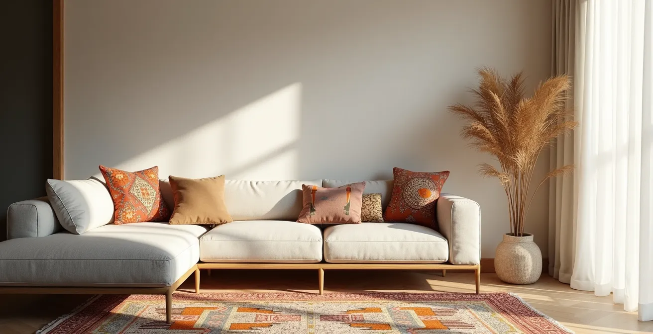
This paragraph introduces the visual concept. To better understand how these percentages translate into a real space, the illustration below breaks down the layers of pattern within a balanced living room.
As the image demonstrates, the rule translates to patterns as follows. Your “60%” is the dominant, foundational layer, which should consist of solids or very subtle, low-contrast textures. This includes your walls, sofa, and largest rug. Your “30%” is the secondary layer, where you introduce medium-scale patterns. This could be an accent chair, curtains, or a collection of throw pillows. Finally, your “10%” is for the boldest, most eye-catching statement pattern—a single, exquisite Suzani cushion or a small, vibrant kilim. According to a guideline used by many designers, a well-structured room often follows a clear ratio of 60% solid textures, 30% medium patterns, and 10% bold accents.
Ikat vs Print: How to Spot Mass-Produced Fakes?
A core tenet of conscious curation is honoring craftsmanship, which means prioritizing authentic, handmade textiles over mass-produced imitations. Not only does this support artisan economies, but it also ensures you are bringing a piece with genuine material integrity into your home. One of the most frequently copied textiles is Ikat, a complex resist-dyeing technique where threads are dyed *before* being woven. The resulting patterns have a characteristic blurriness that is difficult to replicate by machine.
Learning to distinguish a true Ikat from a cheap print is a crucial skill for any collector. A printed “Ikat-style” fabric is simply ink stamped onto a finished cloth, lacking the depth and soul of the real thing. The differences are often subtle but become obvious once you know what to look for. The following table, based on information from experts, breaks down the key markers of authenticity as detailed in a comparative analysis of authentic and printed textiles.
| Feature | Authentic Ikat | Mass-Produced Print |
|---|---|---|
| Edge Quality | Blurry, feathered edges due to resist-dyeing process | Sharp, machine-perfect lines |
| Reverse Side | Pattern identical or clear negative image | Plain, faded, or white reverse |
| Texture | Dye saturates fibers completely | Printed dye sits on surface |
| Material | Traditional cotton or silk | Often polyester or synthetic blends |
| Price Range | Higher due to weeks/months of handwork | Suspiciously low prices |
Ultimately, training your eye and hand is the best defense against fakes. Handle authentic textiles whenever you can to learn their feel. An authentic piece carries the weight of its creation, a quality that can never be truly replicated by a machine. To put this knowledge into practice, use the following checklist during your next textile hunt.
Your Action Plan for Vetting Textile Authenticity
- The Blurry Edge Test: Look closely for the characteristic feathering at the edges of the pattern, a hallmark of true Ikat.
- The Reverse Side Rule: Flip the fabric over. The pattern should be clearly visible, if not identical, on the back.
- The Feel and Fiber Test: Touch the fabric. Does the dye feel like it’s part of the fiber, or does it sit on the surface like a print?
- The Price Litmus Test: Be wary of prices that seem too good to be true. Handmade quality comes at a cost that reflects the artisan’s time.
- The Source Verification: Research the seller. Do they have direct relationships with artisans or a transparent supply chain?
The Sunlight Mistake That Ruins Indigo Textiles in 6 Months
Acquiring a beautiful, authentic textile is only the beginning. As a curator, you also have a duty of preservation. Many global textiles, particularly those made with natural dyes, are extremely vulnerable to environmental damage. Indigo, one of the most ancient and celebrated natural dyes, is notoriously fugitive. Direct and even indirect sunlight contains UV rays that break down its molecular structure, causing the rich, deep blue to fade to a dull, washed-out shade in as little as six months of consistent exposure.
This photograph captures the dramatic effect of sunlight on indigo fibers, showing the stark contrast between a protected area and one that has been exposed to UV radiation.

Protecting these pieces requires a strategic approach to placement and care. Never place a valuable indigo-dyed textile on a sofa or chair that sits in a sunny spot. North-facing walls receive the least direct light and are the safest for displaying light-sensitive art. For windows in the same room, applying a protective film is a wise investment. According to conservation experts, modern UV-filtering films can block up to 99% of harmful rays without noticeably altering the light quality. Another effective strategy is rotational curation: don’t leave the same pieces out year-round. Swap your textiles seasonally to give them a “rest” in a dark, climate-controlled storage area like a closet or cedar chest.
When to Dry Clean: Protecting Embroidered Pillows From Washers
The delicate, three-dimensional nature of many global textiles—especially those with embroidery, beadwork, or mirrors—makes them uniquely susceptible to damage from modern cleaning methods. The impulse to toss a soiled pillow cover into the washing machine can be a fatal mistake. The mechanical agitation of a washer is the primary enemy. It violently snags and breaks the fine threads of embroidery, while the spin cycle can warp the entire piece. Furthermore, a phenomenon known as differential shrinkage can occur, where the base fabric and the embroidery threads (often made of different materials like silk and cotton) shrink at different rates, causing permanent puckering and distortion of the design.
For these reasons, machine washing is strictly off-limits for any textile with embellishments. The safest approach is a hierarchy of gentle, targeted methods. The first line of defense is simply airing the piece outdoors in a shady, breezy spot. For dust, a gentle beating or shaking is often sufficient. If a stain occurs, spot-cleaning is the next step. Use a clean white cloth, a small amount of pH-neutral soap, and minimal water, dabbing gently at the stain. For textiles with mirrors, beads, or tassels, you must work carefully around these elements to avoid loosening threads or adhesives.
Professional dry cleaning should be considered a last resort, reserved only for heavy, all-over soiling that cannot be addressed by other means. Even then, it’s essential to find a reputable cleaner experienced with delicate and vintage textiles. Always point out the material and embellishments, and discuss the risks before proceeding. Preserving the material integrity of these pieces requires a hands-on, preventative approach far more than aggressive cleaning.
Why Mixing More Than 3 Scale Sizes Creates Visual Nausea?
We’ve established the 60-30-10 rule for pattern density, but within that framework lies a more nuanced principle: pattern scale. The common advice to “mix large, medium, and small” patterns is a good starting point, but it doesn’t explain *why* this works or what happens when the balance is off. The answer lies in how our brains process visual information. A room with too many patterns of a similar or competing scale creates a visual cacophony, where no single element can take precedence. The eye doesn’t know where to rest, resulting in a feeling of restlessness or even “visual nausea.”
To create a sophisticated sensory dialogue between your textiles, think of your patterns in terms of a clear hierarchy: the anchor, the connector, and the detail. A successful mix typically involves three distinct scales, and rarely more.
- The Anchor (Large-Scale): This is your dominant, statement pattern. It’s the hero of the room, often found on a large rug or a pair of curtains. Its scale is bold enough to command attention from across the room.
- The Connector (Medium-Scale): This pattern’s job is to support the anchor. It’s often a geometric or striped design on throw pillows or an accent chair. It should be noticeably smaller than the anchor pattern so it doesn’t compete.
- The Detail (Small-Scale): This is a subtle, small-print pattern that often reads as a texture from a distance. It’s found on smaller items like a single lumbar pillow or the trim on a curtain, adding a final layer of complexity without adding noise.
This structured approach creates a clear visual path for the eye to follow. As top designers advise, you should always complement a large floral pattern with stripes or other geometrics of a smaller scale to create this balance. Introducing a fourth or fifth scale disrupts this hierarchy, confusing the eye and breaking the cohesive narrative you’ve worked to build.
How to Pack for a Train Trip Where You Carry Your Own Bags?
While seemingly off-topic, the discipline of packing for a journey where you must carry everything yourself offers a powerful metaphor for sourcing global textiles. When you travel, every item in your bag must be intentional, high-quality, and serve a purpose. The same mindset should be applied when you “pack” your home with textiles acquired on your travels or online. This is the essence of ethical sourcing: moving with intent, leaving a light footprint, and ensuring every piece you bring back has a story you’re proud to carry.
Imagine you are at a market in Oaxaca or a souk in Marrakech. You are surrounded by a sea of beautiful textiles. The tourist’s impulse is to grab many cheap, colorful items. The curator’s approach is different. It involves carrying your own “bags” of responsibility. This means:
- Researching Before You Go: Know the local craft, the signs of quality, and the fair price range. This prevents you from being overcharged and from inadvertently buying mass-produced goods sold as local craft.
- Buying Directly from the Artisan: Whenever possible, seek out the weavers and embroiderers themselves. This ensures the money goes directly to the person whose skill you are admiring, not just a middleman. Ask them about the pattern, the process, and the materials. This is how you acquire the story, not just the object.
- Choosing One Great Piece Over Ten Good Ones: Just as with packing a suitcase, space (and budget) is finite. Focus your resources on one or two truly exceptional pieces that you have a connection with, rather than a jumble of mediocre souvenirs.
This philosophy of “carrying your own bag” extends to every purchase. It’s about taking responsibility for your consumption, questioning the provenance of an item, and choosing to support sustainable, ethical craftsmanship. A home filled with a few, well-chosen, and ethically sourced textiles tells a far richer story than a room cluttered with impulse buys.
Key Takeaways
- Respect precedes aesthetics; always research a pattern’s cultural significance before incorporating it into your home.
- Use the 60-30-10 rule for pattern density (60% solid, 30% medium, 10% bold) to create a balanced visual hierarchy.
- Prioritize authenticity by learning to identify the markers of handmade textiles, such as the blurry edges of a true Ikat.
How to Use Natural Textures to Reduce Sensory Overload?
After carefully selecting patterns based on respect, authenticity, and scale, the final layer of a masterfully curated room is texture. In a space rich with the visual stories of global textiles, natural textures act as the quiet, grounding counterpoint. They are the “sensory rest points” that prevent a room from feeling overwhelming. By incorporating materials like jute, wool, linen, and wood, you create a sensory dialogue that is calming and complex, engaging the sense of touch as much as sight.
This approach is rooted in the principles of biophilic design, which seeks to connect us with the natural world within our built environments. Research in this field shows that fabrics and materials mimicking natural elements, with their earthy tones and organic forms, significantly promote mental well-being. They provide a vital balance to the intricate geometry and vibrant colors of many global patterns. A rough jute rug underfoot, a soft wool throw on a chair, and a smooth linen curtain all work in concert to soothe the senses.
To effectively balance a pattern-heavy room, follow a simple formula for layering textures:
- Create a Haptic Journey: Use a variety of textures to create different tactile experiences throughout the room. Place rougher textures like sisal or jute on the floor, softer ones like bouclé or velvet on seating, and smooth textures like silk or leather on smaller touchpoints.
- Apply the 2:1 Rule: For every patterned textile you introduce, try to add two solid-colored items with distinct natural textures. This ensures the patterns remain the stars of the show, supported by a strong cast of textural solids.
- Layer by Visual Weight: Start with the heaviest, coarsest textures at ground level (rugs) and move to progressively lighter, smoother textures as you go upward (throws, pillows, curtains).
These solid, natural textures provide the essential negative space in your composition. They are the quiet moments in the conversation, allowing the loud, beautiful voices of your patterned textiles to be heard more clearly.
Now that you are equipped with the principles of conscious curation, your journey can truly begin. Start by choosing one textile that speaks to you, research its story, and build a room around its narrative of respect and beauty.
Frequently Asked Questions on How to Mix Global Textiles in a Modern Living Room?
Why can’t embroidered textiles go in the washing machine?
Two main dangers exist: Mechanical agitation snags and breaks delicate threads, and differential shrinkage causes the base fabric and embroidery thread to shrink at different rates, permanently warping the design.
What’s the safest cleaning method for embroidered pieces?
Follow this hierarchy: 1) Regular airing outdoors in shade, 2) Gentle beating/shaking, 3) Spot-cleaning with pH-neutral soap and damp cloth, 4) Professional dry cleaning only for heavy soiling.
How do I clean textiles with mirrors, beads, or tassels?
Never machine-wash or submerge these items. Use spot-cleaning only with a barely damp cloth, working around embellishments carefully to avoid loosening adhesives or threads.