The line between a vibrant maximalist haven and a cluttered mess is discipline, not luck.
- Success lies in applying a strict three-scale rule for patterns (large, medium, small) to avoid visual conflict.
- Adopt a curator’s mindset by implementing a “One In, One Out” rule to keep collections fresh and meaningful.
Recommendation: Treat your space like a personal gallery and yourself as the head curator to achieve intentional, layered beauty without the chaos.
For creatives who adore the rich, personal narrative of a bohemian or maximalist space, there’s a fine line between a room that sings with personality and one that screams with clutter. You collect beautiful objects, textiles from your travels, and patterns that make your heart race, but putting them all together can feel like a high-stakes gamble. The fear of creating a space that looks more like a hoard than a home is real, leaving you paralyzed by choice and defaulting to safer, less expressive designs.
The common advice—”mix different scales,” “stick to a color palette”—is a starting point, but it often misses the fundamental principle. It’s not about simply throwing patterns together and hoping for the best. True, enviable maximalism isn’t chaos; it’s a highly organized system of abundance. The secret isn’t in what you add, but in the framework you use to control it. The shift in mindset is from being a collector to becoming a curator of your own life.
This guide moves beyond the generic tips. We will establish the non-negotiable rules for pattern scale that prevent visual fatigue. We’ll provide a system for displaying your treasured objects without creating dust traps and introduce the discipline needed to maintain a curated look. By thinking like a stylist, you’ll learn to calculate pattern weights, make strategic material choices, and layer with bold confidence. This is your blueprint for controlled, chic maximalism.
To guide you through this process, this article is structured to build your skills layer by layer. From the foundational rules of pattern scale to the fine art of mixing global textiles, each section provides a clear, actionable framework for mastering the maximalist aesthetic.
Summary: How to Layer Patterns and Textures Without Looking Messy?
- Why Mixing More Than 3 Scale Sizes Creates Visual Nausea?
- How to Display Travel Souvenirs Without Creating Dust Traps?
- Jute vs Wool: Which Layering Base Is Easier to Clean?
- The Candle & Fabric Mistake That Risks Your Home
- Optimizing Displays: The ‘One In, One Out’ Rule for Maximalists
- How to Curate Your Shelves Like a Nordic Stylist?
- How to Calculate the 60-30-10 Rule With Busy Patterns?
- How to Mix Global Textiles in a Modern Living Room?
Why Mixing More Than 3 Scale Sizes Creates Visual Nausea?
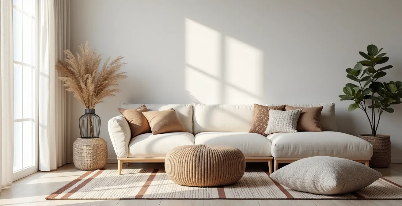
The single most common mistake in layering is a misunderstanding of scale. When patterns are too similar in size, they compete for attention, creating a jarring effect designers call “visual vibration” or, more bluntly, visual nausea. Your brain doesn’t know where to look, so it registers the entire scene as chaotic. The solution is a rigid adherence to the three-scale rule: large, medium, and small. This isn’t just a suggestion; it’s the foundational law of successful pattern mixing. Bold patterns are currently in vogue, with a recent survey showing that 17% of interior designers favor organic and bold or large-scale patterns for 2024.
Your large-scale pattern is the star of the show. This is your statement rug, your dramatic wallpaper, or a bold floral sofa. It sets the tone and color palette for the room. There should only be one. Your medium-scale pattern adds a secondary layer of interest. Think geometric prints on curtains or a patterned armchair. It should be roughly half the size of your large pattern. Critically, these can be the most complex to mix, as two medium-scale patterns will almost always clash.
Finally, your small-scale patterns are the finishing touches. These are the intricate prints on throw pillows, lamp shades, or small art pieces. They add texture and depth without overwhelming the eye. A crucial pro-tip is to include solid-colored textures—a velvet cushion, a chunky knit throw—between patterns. These “visual rests” are essential for allowing each pattern to breathe and be appreciated individually. Always view your combination from 6-8 feet away to see if any patterns are battling for dominance.
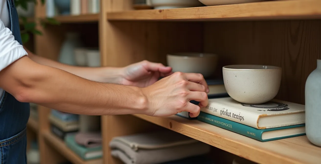
How to Display Travel Souvenirs Without Creating Dust Traps?
A maximalist home tells a story, and your travel souvenirs are the primary authors. The challenge is displaying them in a way that honors their meaning without creating cluttered, hard-to-clean surfaces. The key is to shift from a collector’s mindset (“Where can I fit this?”) to a curator’s (“How does this enhance the story?”). This means every object must earn its place. Professional designers achieve this by creating intentional vignettes rather than random placements, aiming for a “carefully curated look of coziness.”
Case Study: The Curated Look of Coziness
An Oregon-based design studio, Clou-zhouz, demonstrates this principle perfectly. They show how personal collections can be styled with museum-like intention. For coffee tables, they use books as styling elements to create height and anchor smaller objects. By keeping larger furniture in a simple palette (like linen and ivory), the accessories—the souvenirs, the art, the textiles—are allowed to provide contrast and personality without creating chaos. The result is a home that feels deeply personal and layered, but also clean and organized.
To implement this in your own home, you need a system. This system keeps your displays dynamic, meaningful, and dust-free. It’s not about minimalism; it’s about making sure your collection is always at its best.
Your 5-Step Curation Audit: From Collection to Curation
- Implement the ‘Purgatory Box’: Create a temporary holding space (a decorative box or a specific shelf in a closet) for items you’re considering rotating out. This makes the decision to remove something less permanent and stressful.
- Apply the ‘One In, One Out’ Rule: Reframe this as “Intentional Curation.” When you bring a new souvenir home, an existing one must go into the Purgatory Box. This forces you to constantly evaluate and upgrade your collection.
- Conduct a 360-Degree Room Assessment: Stand in each doorway and in the center of the room. What are the first things you see? Do they feel like a cohesive story or a jumble of objects? This helps identify visual clutter hotspots.
- Ask the Trigger Question: Before placing a new item, ask yourself: “Does this new piece tell my story more powerfully than what is currently on this shelf?” If the answer is no, it doesn’t earn its spot.
- Evaluate from All Angles: Sit in every seat in the room—the couch, the floor, your favorite chair. How do your displays feel from these different perspectives? A curated space should feel warm and inviting from every vantage point.
Jute vs Wool: Which Layering Base Is Easier to Clean?
Layering rugs is a hallmark of the cozy, textured maximalist look, but the choice of your base layer is a crucial strategic decision. This isn’t just about aesthetics; it’s about lifestyle, maintenance, and sound. The two most common choices for a large base rug are jute and wool, and their properties are vastly different. Jute provides a natural, rustic texture that grounds a space, while wool offers plush softness and superior sound dampening. However, their performance in a busy home, especially concerning cleaning, dictates their best use.
Understanding these differences is key to building a layered foundation that is both beautiful and practical. This choice will impact not only your cleaning routine but also how well stains are camouflaged and the overall acoustic comfort of your room. The following comparison, based on an analysis from design experts, breaks down the key decision factors.
| Property | Jute | Wool |
|---|---|---|
| Texture Feel | Rough, natural | Soft, plush |
| Cleaning Ease | Easy spot-clean | Requires professional cleaning |
| Stain Camouflage | Poor (uniform color) | Excellent (multi-tonal hides spills) |
| Sound Dampening | Moderate | High |
| Shedding Factor | Low | High initially |
| Best Use | Large base layer | Smaller top layer |
The takeaway is clear: jute’s durability and ease of spot-cleaning make it the ideal, low-maintenance choice for a large, foundational base rug. A smaller, more precious wool or silk rug can then be layered on top in a lower-traffic area, adding plushness and intricate pattern where it’s less likely to be stained. This strategic combination gives you the best of both worlds: texture and practicality.
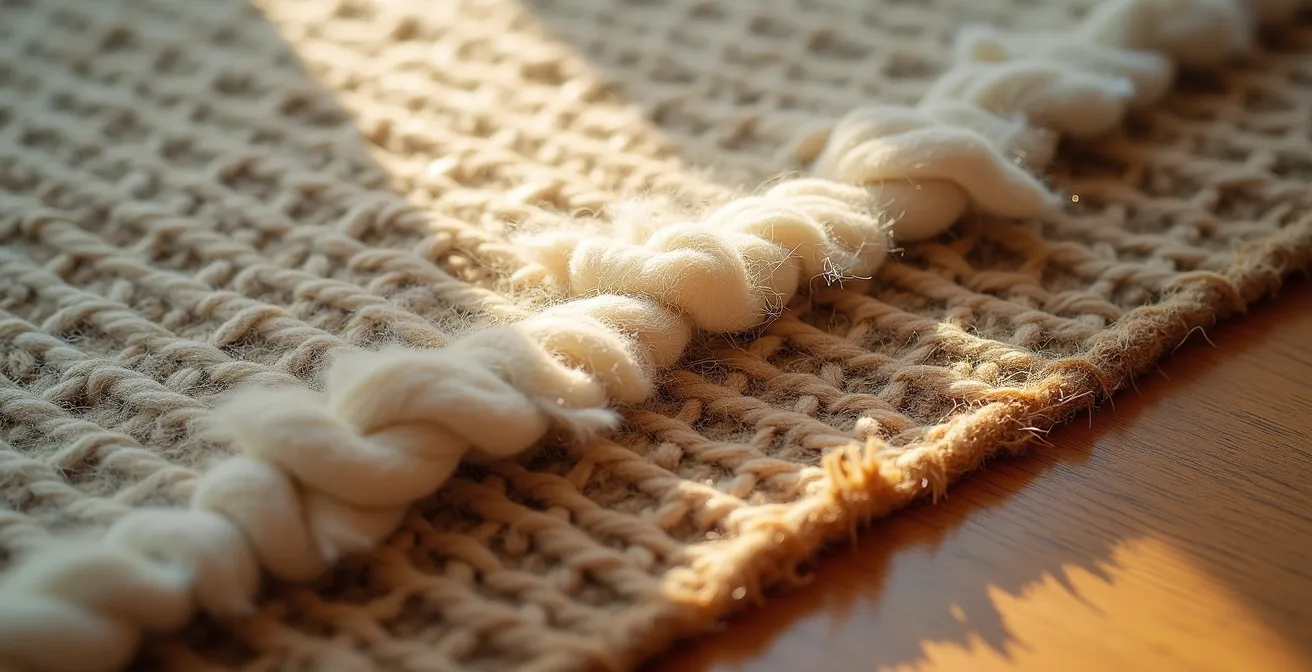
As you can see in the textural details, the robust, thick weave of jute provides a stable and visually grounding base, while the softer, denser pile of wool offers a luxurious and decorative top layer. This pairing is the secret to a functional yet richly layered floor.
The Candle & Fabric Mistake That Risks Your Home
In a maximalist interior, ambiance is everything. The soft glow of candles flickering against layers of rich textiles seems like the ultimate cozy dream. However, this combination poses a significant and often overlooked fire risk. With textiles draped over furniture, plush pillows piled high, and curtains framing the view, an open flame is a hazard waiting to happen. The issue is compounded by the materials themselves; research on material sustainability shows that furniture waste often contains highly flammable synthetic materials.
Beyond the immediate danger of an open flame igniting fabric, there’s a more insidious threat: soot. Paraffin wax candles, the most common type, release invisible soot that builds up on your beautiful textiles over time, leaving them dingy and discolored. A bold maximalist style requires vigilance to protect your curated collection of fabrics. Fortunately, creating a safe and beautiful ambiance is entirely possible with a few non-negotiable rules.
Follow these guidelines strictly to enjoy the warm glow of candles without putting your home or your precious textiles at risk:
- Mind the Gap: Always maintain a minimum 12-inch clearance between any candle, even a small one, and flammable materials like curtains, throws, or pillows.
- Choose Your Wax Wisely: Opt for soy or beeswax candles over paraffin. They burn cleaner and produce significantly less soot, protecting your fabrics from long-term damage.
- Contain the Flame: Use hurricane lamps, cloches, or deep glass shields to contain the flame. This not only adds a layer of safety but also creates a sophisticated, layered lighting effect.
- Prioritize Natural Fibers: When possible, select naturally flame-retardant fabrics like wool for throws and pillows near seating areas where candles might be used. They are much safer than synthetics like polyester or acrylic.
- Embrace Flameless Alternatives: Today’s high-end flameless LED candles are remarkably realistic. They provide all the ambiance and flicker of a real flame with zero risk, making them the ultimate worry-free choice for a textile-rich environment.
Optimizing Displays: The ‘One In, One Out’ Rule for Maximalists
For many maximalists, the “One In, One Out” rule sounds like a minimalist torture tactic. It conjures images of sterile, empty spaces—the very opposite of the vibrant, story-rich homes we aim to create. However, this is a misunderstanding of the rule’s true purpose. For a stylist, it’s not about restriction; it’s about evolution. Reframing this as “Intentional Curation” transforms it from a painful sacrifice into a powerful tool for elevating your space.
The goal is to ensure your collection is constantly improving in quality and personal meaning. Every object on display should be a “10 out of 10” in your heart. When you bring home a new treasure, the “One In, One Out” rule forces you to critically assess your current display. Is the new object a better representation of your story than something already there? If so, the weaker piece is retired to the “purgatory box” or passed on. This prevents stagnation and the slow creep of clutter, keeping your home feeling alive and dynamic, not like a dusty museum.
Case Study: The Power of ‘Intentional Curation’
The design platform DecorMatters highlights how successful maximalists apply this principle. Their case studies show that statement pieces—a stunning sofa, a huge area rug, an inherited lamp—should “tell a story.” The ‘One In, One Out’ approach ensures that the supporting objects don’t dilute the impact of these heroes. Users report this method helps them maintain a “homey feel” while preventing spaces from becoming visually overwhelming. It’s a system for ensuring your home’s narrative is always clear, compelling, and edited to perfection.
To put this into practice, don’t rush your decisions. Designers often evaluate hundreds of options before finalizing a scheme. Apply a “sleep on it” rule before making any permanent display change. Walk away and come back multiple times until every element feels harmonious. This disciplined process of rotation and evaluation is what separates a breathtaking maximalist interior from a simple collection of stuff.
How to Curate Your Shelves Like a Nordic Stylist?
At first glance, the minimalist-leaning Nordic aesthetic seems at odds with bold maximalism. However, adopting the core principles of Nordic curation can be a powerful secret weapon for organizing a maximalist’s treasures. The key lies in the Swedish concept of Lagom: “just the right amount.” For a maximalist, this doesn’t mean having fewer things; it means arranging them with such precision and care that the result feels balanced and intentional, not overwhelming. It’s about finding harmony within abundance.
The Interior Design Nook demonstrates this by applying a Lagom-inspired approach to shelf styling. The first step is to take a complete inventory of all patterned and textured items you own—vases, books, textiles, boxes. Seeing everything together often reveals unexpected combinations and color stories. Nordic styling then emphasizes a calm canvas; start with a neutral base color for the shelves themselves to let your objects shine. Select a tight foundation palette of 2-3 complementary colors to run through your display, which will unify disparate objects.
The real art is in varying proportions and textures. Mix large, sculptural statement pieces with smaller, more delicate accents. Let one object be the focal point of each shelf, with others playing a supporting role. Most importantly, layer different textures within the same color family—a velvet box next to a linen-bound book, or a ceramic vase against a woven basket. This creates a rich, tactile experience that feels sophisticated and deeply considered. By following designers you admire, you develop an eye for these combinations, building the confidence to arrange your own collections with this harmonious balance.
How to Calculate the 60-30-10 Rule With Busy Patterns?
The 60-30-10 rule is a classic design principle, typically applied to color: 60% of the room is a dominant color, 30% a secondary color, and 10% an accent. But as a maximalist stylist, you must learn to apply this concept to something far more complex: pattern weight. In a room filled with busy patterns, thinking in terms of visual weight is how you maintain order and create a clear hierarchy. Each pattern is assigned a role and a corresponding percentage of visual real estate.
This framework prevents patterns from competing and is the mathematical secret to a balanced, layered look. Instead of guessing, you are allocating space with intention. An expert guide to mixing patterns breaks down this distribution into clear roles, helping you visualize how to allocate your patterns for maximum impact without chaos.
| Pattern Role | Visual Weight % | Scale Type | Typical Application |
|---|---|---|---|
| Atmosphere (60%) | Dominant but calm | Large scale | Rugs, wallpaper, major furniture |
| Personality (30%) | Medium contrast | Medium scale | Chairs, curtains, throws |
| Jewelry (10%) | High impact accent | Small scale | Accent pillows, art details |
To apply this practically, start by identifying your three patterns—one large, one medium, one small—that share at least one common color. Then, use a simple digital tool to test your calculation. Take photos of your patterns and use a free program like Canva or even PowerPoint to create a digital mood board. Adjust the images to roughly match the 60-30-10 proportions in the room. This quick mock-up allows you to see if the balance is right before you commit to buying fabric or painting a wall. Step back from your screen to simulate viewing it from across the room—if it feels harmonious, you’ve successfully calculated your pattern weights.
Key Takeaways
- The Three-Scale Rule (Large, Medium, Small) is the non-negotiable foundation for mixing patterns without creating visual chaos.
- Adopt a curator’s mindset with a “One In, One Out” policy, reframed as “Intentional Curation,” to keep your collections dynamic and meaningful.
- The 60-30-10 rule is not just for color; apply it to “Pattern Weight” to create a clear visual hierarchy in a busy room.
How to Mix Global Textiles in a Modern Living Room?
Integrating global textiles—like Moroccan rugs, Indian block prints, and Japanese Shibori dyes—is a beautiful way to tell a story of travel and cultural appreciation. The rising global influence on design is undeniable, as market analysis shows the Asia-Pacific region alone captured over 36% of interior design revenue in 2024, driving demand for cross-cultural aesthetics. However, mixing these powerful patterns in a modern living room can quickly feel disjointed. The secret to creating harmony lies in two key areas: a unifying color palette and a strict variation in pattern scale.
Think of your color scheme as the thread that ties everything together. You can successfully combine an oriental rug with geometric African mud cloth if they both share a consistent color story, such as a blue and white scheme or warm earth tones. This common color ground allows the different cultural patterns to speak to each other rather than shout over one another.
Case Study: Global Harmony in New York
The design firm Murphy Deesign showcases this perfectly in a New York E-Design project. They fearlessly combined oriental patterns with modern geometric designs by maintaining a strict blue and white color scheme throughout. The scales were intentionally varied: a small-scale graphic on the wallpaper, large-scale patterns on the pillows, and a medium buffalo plaid on a throw. This created a cohesive look that felt layered and sophisticated. They even proved a “crazy colorful” vintage rug could work by tying its accent colors to other elements, like yellow furniture and coordinated book spines on a shelf.
Your modern furniture acts as the perfect neutral backdrop for this global conversation. A clean-lined sofa or a simple wooden coffee table provides a quiet space, allowing the rich textures and histories of your textiles to take center stage. By anchoring your eclectic collection with a disciplined color strategy and a clear pattern hierarchy, you create a space that is worldly, personal, and impeccably modern.
You now hold the stylist’s playbook. You have the rules for scale, the system for curation, and the formulas for balance. It is time to stop collecting and start curating. Your most vibrant, personal, and impeccably organized space awaits.