A chaotic open plan feels less like a home and more like a hallway, but the solution isn’t about filling space; it’s about engineering flow.
- Define functional zones with “invisible boundaries” like rugs and furniture groupings to create purposeful destinations.
- Prioritize clear, unobstructed traffic paths with a minimum of 36 inches of clearance to eliminate bottlenecks.
- Actively manage sightlines from key seating areas to hide visual clutter and enhance the sense of calm.
Recommendation: Start by mapping your family’s daily movements to identify and eliminate frustrating bottlenecks, reclaiming control over your space one pathway at a time.
An open plan layout promises light, space, and a sense of connection. Yet for many families, the reality is a single, cavernous room that feels messy, undefined, and frustrating to live in. The dining table becomes a dumping ground, the living area feels like a thoroughfare, and there’s a constant sense of visual noise. The common advice is to simply “create zones” with furniture or use decorative room dividers, but these solutions often fail to address the root of the problem.
The chaos in an open plan doesn’t stem from a lack of decoration, but from a lack of spatial structure. When every part of the space is visually and physically accessible from every other part, it loses its purpose. It becomes a giant hallway, a space for transit rather than a space for living. Without clear boundaries, movement becomes haphazard and sightlines become cluttered, leading to that feeling of perpetual mess and disorganization.
But what if the key wasn’t just to visually separate the space, but to strategically engineer it? The true solution lies in thinking like a spatial planner. This involves a more profound approach focused on two core principles: traffic flow engineering and sightline management. It’s about creating invisible boundaries that guide movement, and carefully controlling what is seen—and what remains hidden—from the primary areas of relaxation.
This guide will walk you through a structured method to reclaim your open plan. We will move beyond generic decorating tips to provide a system for analyzing and solving the functional problems of your layout. You will learn how to transform your chaotic space into a series of interconnected, purposeful destinations that are both beautiful and a pleasure to navigate.
To help you navigate these concepts, this article is structured to address the most common challenges of open plan living. The following sections provide a complete roadmap, from identifying the core problem to implementing advanced zoning techniques.
Summary: How to Fix a Chaotic Open Plan Layout: A Spatial Planner’s Guide
- Why Your Open Plan Living Room Feels Like a Hallway?
- How to Use Rugs to Define Dining and Living Areas?
- L-Shape vs Sofa Pair: Which Controls Traffic Flow Better?
- The Coffee Table Mistake That Bruises Your Shins
- Optimizing Sightlines: Hiding the Kitchen Mess From the Sofa
- The Layout Mistake That Wastes 20% of Your Floor Plan
- Bookcase vs Wardrobe: Which Divider Blocks Sound Better?
- How to Create a Private Bedroom in a Studio Loft Without Building Walls?
Why Your Open Plan Living Room Feels Like a Hallway?
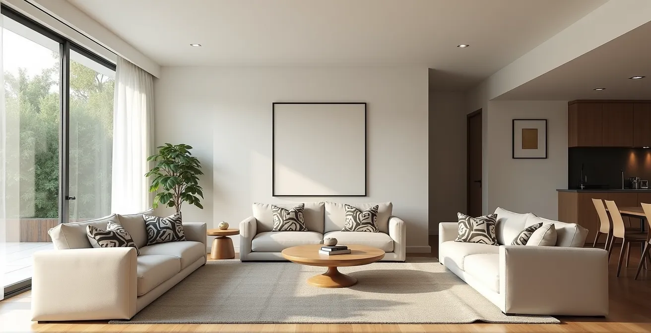
The primary reason an open plan space feels like a hallway is the absence of defined destinations and clear pathways. When furniture is pushed against the walls, the central area becomes a vast, undefined void that serves only as a corridor for moving between different points. This lack of structure forces all movement through the middle of the living or dining zones, disrupting conversations and creating a sense of constant transit rather than rest. As one design challenge highlights, even with careful placement, centering a sofa for TV viewing can inadvertently create uncomfortably narrow pathways, reinforcing the “hallway” effect.
The solution is to stop thinking about the room as a single empty box and start thinking of it as a network. The first step in traffic flow engineering is to map out the natural patterns of movement. These are the routes people take for daily tasks: from the kitchen to the dining table, from the entrance to the sofa, from the living area to the back door. Once you identify these primary traffic routes, your goal is to protect them. Furniture should be arranged to create and frame these pathways, not obstruct them. Floating furniture away from the walls is a key technique here; it allows you to build zones in the center of the space, automatically creating dedicated walkways around their perimeters.
By consciously designing these routes, you create a clear spatial hierarchy. Some areas are designated for movement, while others are designated for dwelling. This immediately reduces the feeling of chaos, as the space gains a logical, intuitive structure. People can move freely without cutting through a conversation or blocking someone’s view, transforming the “hallway” into a well-organized system of purposeful zones.
Your Action Plan: Audit Your Home’s Traffic Flow
- Map the Pathways: Identify and list all the primary routes of movement in your space (e.g., front door to kitchen). These are your non-negotiable traffic channels.
- Inventory Your Layout: Take a photo of your current layout. Mark all the furniture pieces that sit directly in or on the edge of your mapped pathways.
- Check for Coherence: Confront your layout with your desired use of the space. Does the main path to the garden cut right through the kids’ play area? Adjust accordingly.
- Measure for Movement: Use a tape measure to check clearance. Ensure there is at least 36 inches for main pathways. Identify any “bottlenecks” narrower than this.
- Implement and Test: Rearrange one piece of furniture to clear a key bottleneck. Live with it for a day and observe if the flow improves before making larger changes.
Ultimately, reclaiming your open plan begins with this crucial shift in perspective: you are not just decorating a room, you are directing the flow of daily life within it.
How to Use Rugs to Define Dining and Living Areas?
Rugs are the most powerful tool for creating invisible boundaries in an open plan layout. More than just a decorative element, a well-placed area rug acts as a visual anchor, clearly delineating a specific functional zone and transforming it into a “purposeful destination.” By placing a rug under your living room seating arrangement, you are psychologically enclosing that space, signaling that this is an area for conversation and relaxation. Similarly, a rug under the dining table and chairs carves out a distinct zone for meals, separating it from the flow of traffic around it. This visual separation is fundamental to breaking up a large, chaotic room into smaller, manageable, and calmer areas.
This image demonstrates how two distinct rugs create clear visual zones for living and dining, even without any physical walls. The “frame” of exposed flooring between them acts as a natural pathway.
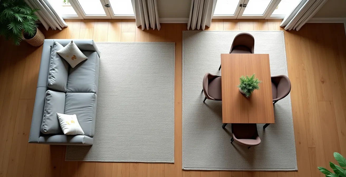
However, the effectiveness of a rug depends entirely on its size and placement. A rug that is too small will look like a postage stamp and fail to unify the furniture, worsening the sense of fragmentation. The key is to choose a rug large enough for at least the front legs of all main seating pieces to rest on it. This physically connects the furniture, creating a single, cohesive unit. In a dining area, the rule is even more strict: the rug must be large enough so that all chair legs remain on it, even when the chairs are pulled out from the table. This typically requires the rug to extend at least 24 inches beyond the table on all sides.
A recent comparative analysis provides clear guidelines for selecting the right rug size to effectively anchor your zones.
| Room Type | Recommended Size | Key Measurement Rule |
|---|---|---|
| Living Room (Standard) | 8’x10′ or 9’x12′ | Make sure your rug is at least 6″ wider (8″ is ideal) than your sofa on both sides. Typically run the rug the length of the sofa. |
| Dining Room | 8’x10′ minimum | Choose a rug that accommodates the dining table and allows enough space for chairs to move freely when pulled in and out. Your rug should extend at least 24 inches beyond all sides of the table. This allows guests to pull out chairs without the legs leaving the rug. |
| Open Plan Areas | 9’x12′ or larger | Aim to leave about 6 to 18 inches of exposed floor between the edges of your rug and the walls. This frame of flooring helps create visual balance while allowing the rug to connect your furniture into one cohesive zone. |
By adhering to these principles, you use rugs not just to decorate, but to build the very foundation of your spatial hierarchy, bringing order and intention to your layout.
L-Shape vs Sofa Pair: Which Controls Traffic Flow Better?
The choice between an L-shaped sofa and a pair of sofas is a critical decision in traffic flow engineering. It’s not just about seating capacity; it’s about how you direct movement and define boundaries. An L-shaped or sectional sofa inherently creates a “closed circuit.” It forms a hard corner, effectively acting as a low wall that blocks traffic and contains a zone. This makes it an excellent tool for carving out a distinct living area from a larger space, clearly separating it from a kitchen or dining zone. It forces foot traffic to go *around* the seating area, not through it, which is ideal for creating an intimate, protected conversation pit.
Conversely, a pair of sofas facing each other creates an “open circuit.” The space between the two sofas allows for visual and physical flow, making the arrangement feel more inviting and less rigid. This setup is superior for layouts where you want to encourage movement through the space or maintain a longer sightline. By arranging the sofas to face each other, you create intimate “breakout pods” for conversation while still allowing people to pass between them if needed. This flexibility is invaluable in more formal settings or in long, narrow rooms where an L-shape might feel too bulky.
Regardless of your choice, the cardinal rule is to ensure adequate clearance. Interior design standards recommend at least 36 inches of clearance between furniture pieces for comfortable pathways. This space is non-negotiable for preventing bottlenecks and maintaining a feeling of ease and openness.
This comparison highlights how different sofa configurations shape the social dynamic and direct the flow of traffic in an open-concept living room.
| Configuration | Traffic Flow Pattern | Social Dynamic | Best For |
|---|---|---|---|
| L-Shaped Sofa | Creates ‘closed circuit’ – blocks traffic, defines boundary | Single, inclusive conversation area for larger groups | Corner spaces, creating defined zones |
| Sofa Pair | Creates ‘open circuit’ – allows flow between pieces | Arrange furniture in conversational groupings to create intimate seating areas. Instead of pushing furniture against walls, float them in the room and arrange them to face each other to create a sense of connection among breakout pods. | Flexible layouts, formal settings |
| Sectional | Uses the Hamilton Round Chaise Sectional Sofa to separate the space between the kitchen and living room. | Anchors large seating area | Open floor plans needing zone separation |
Ultimately, the “better” option depends on your goal. Do you want to protect a zone and halt traffic? Choose an L-shape. Do you want to encourage flow and flexibility? A sofa pair is likely the superior choice.
The Coffee Table Mistake That Bruises Your Shins
The most common coffee table mistake is choosing a piece that is too large or poorly positioned, turning it into a major obstacle in a key traffic path. In the context of traffic flow engineering, the coffee table is often the number one culprit for creating bottlenecks. It sits right in the middle of a primary destination—the living zone—and if it’s too big, it can completely choke the pathways between the sofa and surrounding chairs, leading to bruised shins and daily frustration. The goal is to facilitate movement, not hinder it, and this requires careful consideration of both size and clearance.
The ergonomic sweet spot for placement is to maintain a distance of 14 to 18 inches between the edge of your sofa and the coffee table. This is close enough to comfortably reach for a drink or book, but far enough to allow legroom. More importantly, you must consider the paths *around* the table. You need to be able to walk from the sofa to an adjacent chair without turning sideways. If the path is too tight, the table is too big for the arrangement. It’s also crucial to consider visual weight versus physical footprint. A solid, dark wood table may feel much larger and more obstructive than a glass one, even if they have the same dimensions.
To avoid this common pitfall, consider more flexible alternatives to the single, monolithic coffee table. Opting for a cluster of two smaller tables or a set of nesting tables allows you to reconfigure the space as needed. You can pull them apart to create a wider pathway for guests or push them together for a larger surface during a family game night. Another excellent solution is using C-tables, which are designed to slide over the arm or seat of a sofa. This provides a convenient surface without creating a central obstacle at all, keeping the primary circulation path completely clear. The use of modular furniture is a key strategy for ensuring your layout can adapt to different needs, preventing the fixed bottlenecks that cause so much frustration.
By treating the coffee table not as a centerpiece but as a functional component within your traffic flow system, you can maintain both convenience and clear, bruise-free pathways.
Optimizing Sightlines: Hiding the Kitchen Mess From the Sofa
A major source of chaos in an open plan is uncontrolled sightlines. If your main relaxation spot—the sofa—has a direct, uninterrupted view of the messiest part of your home—the kitchen counter—it’s impossible to ever feel truly at rest. Sightline management is the art and science of controlling what you see from key viewpoints. It’s not about building walls, but about creating strategic “partial screens” and visual layers that mask clutter while preserving the sense of openness. The goal is to curate the view, revealing the beautiful and concealing the chaotic.
This perspective from a living area shows how strategically placed elements, like a tall plant and an open bookshelf, can partially screen the kitchen, breaking up the sightline and hiding potential mess without closing off the space.
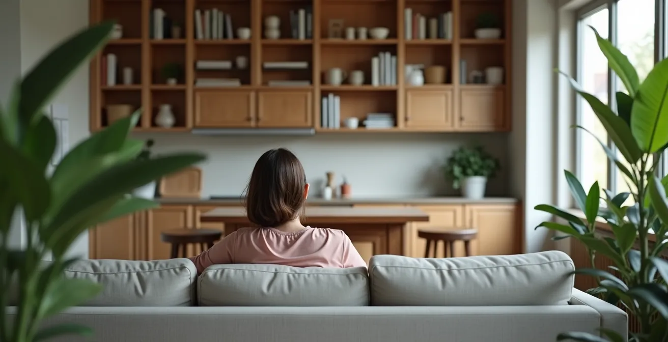
An effective technique is to analyze the view from both a seated and a standing position. From the sofa, you want to see as little of the functional kitchen surfaces as possible. A strategically placed tall plant, a floor lamp, or an open-backed bookshelf can work wonders. An open-backed shelf is particularly effective; it creates a visual boundary and allows you to curate what’s seen through it—a collection of beautiful pottery, for example—while masking the pile of dirty dishes just beyond. This creates a “controlled reveal,” adding depth and interest to the space instead of presenting a single, flat, and often messy vista.
Lighting also plays a crucial role in sightline management. By putting kitchen lights on a dimmer and using brighter, focused task lighting in the living area (like a reading lamp by the sofa), you can draw the eye towards the intended zone of focus and allow the cluttered areas to recede into the shadows. Another advanced technique is creating a “sacrificial landing zone.” This is a beautifully designed, contained drop zone—like a decorative tray on a console table—that is visible from the sofa. It’s designed to attract the inevitable daily clutter (keys, mail, sunglasses) into one controlled, aesthetically pleasing spot, preventing it from spreading across the kitchen counters that are in your direct line of sight.
By thoughtfully placing these subtle barriers and controlling focus, you can enjoy the spaciousness of an open plan without being visually assaulted by its operational mess.
The Layout Mistake That Wastes 20% of Your Floor Plan
The single biggest layout mistake that wastes valuable floor space is creating poorly defined or oversized pathways. In an effort to keep things “open,” many people create vast, empty corridors that serve no purpose other than transit. This “dead space” is often found in the no-man’s-land between a living area and a dining area. While circulation is crucial, these pathways are frequently far wider than necessary, consuming square footage that could be used for storage, seating, or other functions. Efficient spatial planning dictates that you size your pathways for their purpose and reclaim the rest.
Interior design guidelines provide a clear formula for optimizing this space. According to a study on maximizing open floor plans, you can effectively reclaim space by adhering to specific dimensions. The guidance suggests that major traffic paths should be about 36 inches wide, while minor paths can be as narrow as 24 inches. Any width beyond this in a primary walkway can be considered “wasted” space. By measuring your current pathways and tightening them to these efficient standards—perhaps by extending a rug, repositioning a console table, or nudging a seating area over—you can often reclaim a significant sliver of floor plan, sometimes as much as 20% in an inefficient layout.
Once you’ve reclaimed this space, the key is to assign it a purpose. This is where dual-purpose zoning comes into play. That newly found strip of floor behind the sofa could become a dedicated yoga and stretching zone. The space beside the dining area could house a slim, wall-mounted desk that folds away when not in use, transforming the area into a part-time home office. An oversized ottoman with built-in storage can serve as both a coffee table and extra seating, making the living zone more flexible. The first step is to draw a basic outline of your home and plan these zones on paper. By consciously planning for flexibility, you ensure every square foot of your home is working for you, eliminating wasted space and maximizing functionality.
This strategic approach transforms empty, purposeless voids into active, functional parts of your home, making your layout feel both larger and more intelligent.
Bookcase vs Wardrobe: Which Divider Blocks Sound Better?
When creating zones in an open plan, visual separation is only half the battle. For true privacy, especially when carving out a bedroom or office space, you need acoustic separation. Furniture can be a surprisingly effective tool for this, but not all pieces are created equal. The choice between a bookcase and a wardrobe as a room divider comes down to a trade-off between sound blocking and sound absorption. A dense, solid wardrobe is the undisputed champion of sound blocking. Its mass and solid back panel physically obstruct sound waves from passing through, providing the highest level of noise reduction. However, its large, flat surfaces do little to absorb sound, and can sometimes contribute to echo within a space.
A bookshelf offers a more nuanced acoustic performance. An open-back bookshelf provides almost no sound blocking, acting merely as a visual screen. A solid-back bookshelf, however, performs significantly better. The real acoustic advantage of a bookshelf lies in sound absorption. When filled with books of varying sizes and depths, it creates an irregular, textured surface that is excellent at diffusing sound waves, breaking them up and reducing echo and reverberation. For the best of both worlds, a solid-back bookshelf, densely packed with heavy books, offers a good balance of moderate sound blocking and excellent sound absorption.
For those seeking maximum noise reduction with a minimal footprint, other options exist. As one analysis points out, a glass partition can be an effective solution for blocking noise while still allowing light to pass between spaces. For even greater separation, etched or textured glass can obscure the view, adding a layer of visual privacy.
This table breaks down how different types of dividers perform in terms of blocking and absorbing sound, helping you choose the best option for your specific privacy needs.
| Divider Type | Sound Blocking | Sound Absorption | Best Use Case |
|---|---|---|---|
| Open-back bookshelf | Poor | Good (with books) | Visual separation only |
| Solid-back bookshelf | Better | Excellent (irregular book shapes diffuse sound) | Moderate noise reduction |
| Full wardrobe | Best (mass blocks sound) | Poor (flat surface causes echo) | Maximum sound blocking |
| Glass partition | A glass partition helps block noise while letting light pass between spaces. If you want to obscure the view to further separate rooms, consider etched or textured glass. | Poor | Noise reduction with light transmission |
By selecting your divider based on its acoustic properties, you can create zones that are not just visually separate, but also provide a genuine sense of peace and quiet.
Key Takeaways
- Zone with Purpose: Don’t just decorate; create distinct “destinations” for living, dining, and working using rugs and furniture as anchors.
- Engineer Your Traffic Flow: Identify primary pathways and keep them clear with a minimum of 36 inches, arranging furniture to guide movement, not obstruct it.
- Manage Your Sightlines: Strategically use partial screens, plants, and lighting to hide visual clutter from your main relaxation areas, creating a perpetual sense of calm.
How to Create a Private Bedroom in a Studio Loft Without Building Walls?
Creating a truly private bedroom in a studio loft without resorting to permanent construction requires a multi-layered approach that addresses three distinct types of privacy: visual, acoustic, and psychological. Relying on a single screen or curtain is rarely enough. The most successful solutions combine several elements to create a robust sense of separation, transforming an open corner into a sanctuary. This involves thinking beyond simple dividers and architecting a complete threshold experience.
For visual privacy, ceiling-mounted curtain tracks offer the most flexibility. Using a double track allows you to layer a sheer curtain with a heavy, blackout one. The sheer provides diffused light and a sense of separation during the day, while the blackout curtain offers complete light and visual blockage at night. For acoustic privacy, soft surfaces are your best ally. A thick, high-pile area rug is essential, as it absorbs noise and helps define the bedroom zone. Combining this with heavy velvet curtains, an upholstered headboard, and strategically placed furniture like a wardrobe or a densely packed bookshelf (as discussed previously) creates multiple layers of sound-dampening mass.
Perhaps the most overlooked aspect is psychological privacy. This is the feeling of entering a distinct and separate space. You can create this by building a “threshold experience.” For example, placing two wardrobes opposite each other can form a small “entryway” into the bedroom zone. Elevating the bed on a platform or using a different flooring material (like a large rug that covers the entire bedroom footprint) can also signal a transition into a new, more private area. This layering of rugs, curtains, and furniture placement is a powerful strategy. It works by creating a visually distinct area while also enhancing decor and absorbing noise, which is critical when multiple activities are happening in one large space.
By combining these visual, acoustic, and psychological strategies, you can construct a private and peaceful bedroom retreat, achieving the function of a wall without ever having to build one.