In summary:
- Achieving a high-end Scandinavian look is less about expensive furniture and more about mastering core design principles.
- Focus on creating “visual silence” by decluttering and using negative space intentionally to foster a sense of calm.
- Leverage a rich dialogue between natural textures, varied materials, and layered lighting to build warmth and sophistication.
- Adopt smart, thrifty strategies like transforming existing furniture and using a mix of finishes to add depth without the cost.
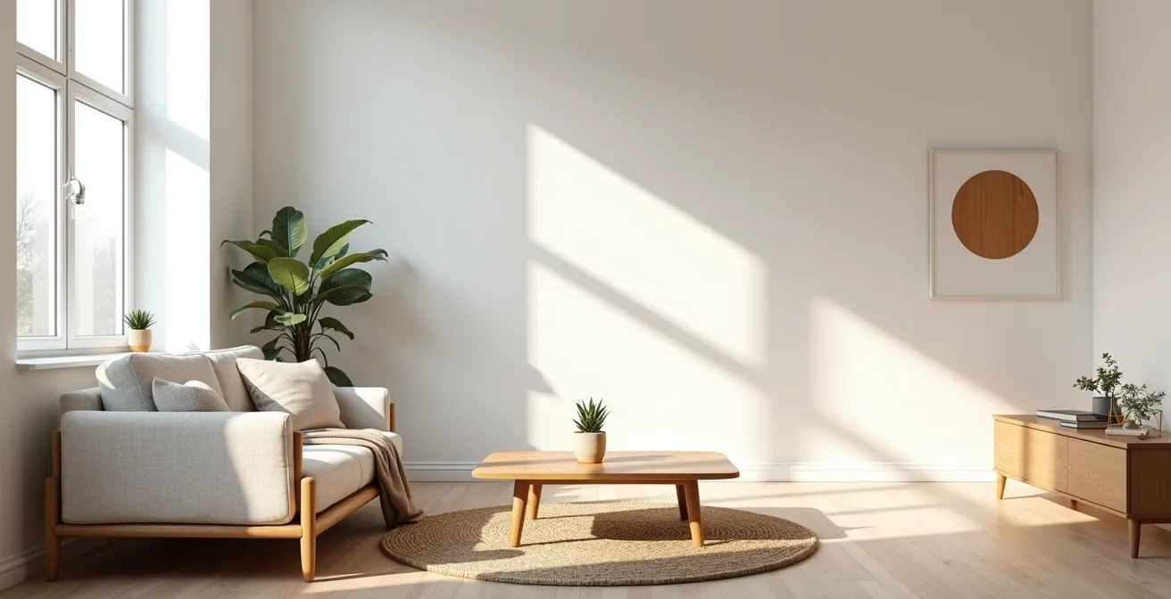
You scroll through your feed and there it is again: another flawlessly serene living room, bathed in soft light, with a perfect blend of cozy textures and minimalist furniture. The Scandinavian aesthetic is undeniably alluring, promising a life of stylish simplicity and calm. But a quick search for that iconic armchair or that perfectly rustic wooden coffee table often leads to a jarring reality check. The price tags can feel anything but minimalist. Many guides will point you toward the usual big-box stores, but that often results in a space that feels like a catalog replica rather than a personal sanctuary.
The common advice to simply “declutter and paint everything white” is an oversimplification that misses the soul of Nordic design. This approach can easily lead to a home that feels cold, sterile, and impersonal—the exact opposite of the warm, inviting ‘hygge’ feeling you’re chasing. The truth is, the magic of Scandinavian style doesn’t come from a specific brand or a high price tag. It’s born from a deeper understanding of how our environment affects our well-being.
But what if the secret wasn’t in what you buy, but in *how* you think about your space? This guide is built on a different premise: achieving a luxe Scandinavian look on a budget is about becoming a savvy curator of your own home. It’s about mastering the underlying principles of visual silence, textural balance, and intentionality. We will explore how to make strategic choices that create a feeling of bespoke luxury, often using what you already have or making only small, targeted investments. We’ll delve into the psychology of space, the art of material selection, and the lighting strategies that can transform any room. Get ready to create a home that looks expensive but is, at its heart, incredibly smart.
To guide you on this journey to affordable chic, we’ve broken down the essential strategies into a clear roadmap. This article will walk you through the core concepts, from the philosophy of ‘just enough’ to the practical application of lighting and texture, ensuring you have all the tools to build your serene, stylish sanctuary.
Table of Contents: A Guide to Affordable Scandinavian Style
- Why ‘Just Enough’ Decor Creates More Peace Than Abundance
- How to Curate Your Shelves Like a Nordic Stylist
- Ash vs. Pine: Which Wood Tone Fits Your Color Palette?
- The ‘All White’ Mistake That Makes Your Home Feel Like a Hospital
- Optimizing Hygge: Layering Blankets for Seasonal Comfort
- How to Use Tactile Textures to Lower Your Heart Rate
- When to Purge Belongings: The 6-Month Usage Rule
- How to Beat the Winter Blues With ‘Hygge’ Lighting Strategies
Why ‘Just Enough’ Decor Creates More Peace Than Abundance
The core of the Scandinavian aesthetic isn’t emptiness, but intentionality. This philosophy, often encapsulated in the Swedish concept of ‘lagom’ (not too much, not too little), has profound psychological benefits. In a world of constant stimulation, a home filled with clutter acts as a source of low-grade, persistent stress. Our brains are hardwired to process everything in our field of vision, and cluttered environments overload the visual cortex, causing mental fatigue and slower decision-making. It’s the visual equivalent of having too many browser tabs open; nothing gets your full attention, and your system slows down.
This isn’t just a feeling; it’s backed by science. As a study from UCLA found, our brains interpret visible clutter as unfinished business, keeping our stress responses constantly activated. The research confirmed that people living in cluttered homes have higher levels of cortisol, the stress hormone, throughout the day. By consciously choosing ‘just enough,’ you are not depriving yourself. Instead, you are creating what designers call “visual silence”—a state where your mind is free from the constant, subconscious work of processing excess stuff. This mental quietness allows for deeper relaxation and a greater sense of control over your environment.
Achieving this isn’t about stark minimalism but about curation. Every object in your space should either serve a clear function or bring you genuine joy. This principle transforms your home from a mere storage unit into a supportive sanctuary. The goal is to make space for your life to unfold, not just to accumulate possessions. By embracing this mindset, you’ll find that a well-edited home not only looks more stylish and sophisticated but also actively contributes to your mental peace and well-being.
Ultimately, this approach is the most budget-friendly design tool of all, as it centers on removing things rather than acquiring new ones.
How to Curate Your Shelves Like a Nordic Stylist
Open shelving is a hallmark of Scandinavian design, but it can quickly go from chic to chaotic without a clear strategy. The secret isn’t just about having nice objects; it’s about mastering the art of composition and negative space. A professionally styled shelf is a practice in intentional curation, where each item is given room to breathe and contribute to a balanced whole. It’s a small-scale reflection of the entire home’s philosophy: every piece matters.
To achieve this look, stylists often follow an unspoken formula that balances different elements. Think of your shelf as a mini-exhibition. You need a mix of shapes, heights, and textures to create visual interest. Instead of lining things up in a row, group them in clusters, often in odd numbers like threes or fives, which is more pleasing to the eye. This visual trick creates dynamic little vignettes that draw you in. This image perfectly captures the essence of this balanced approach.
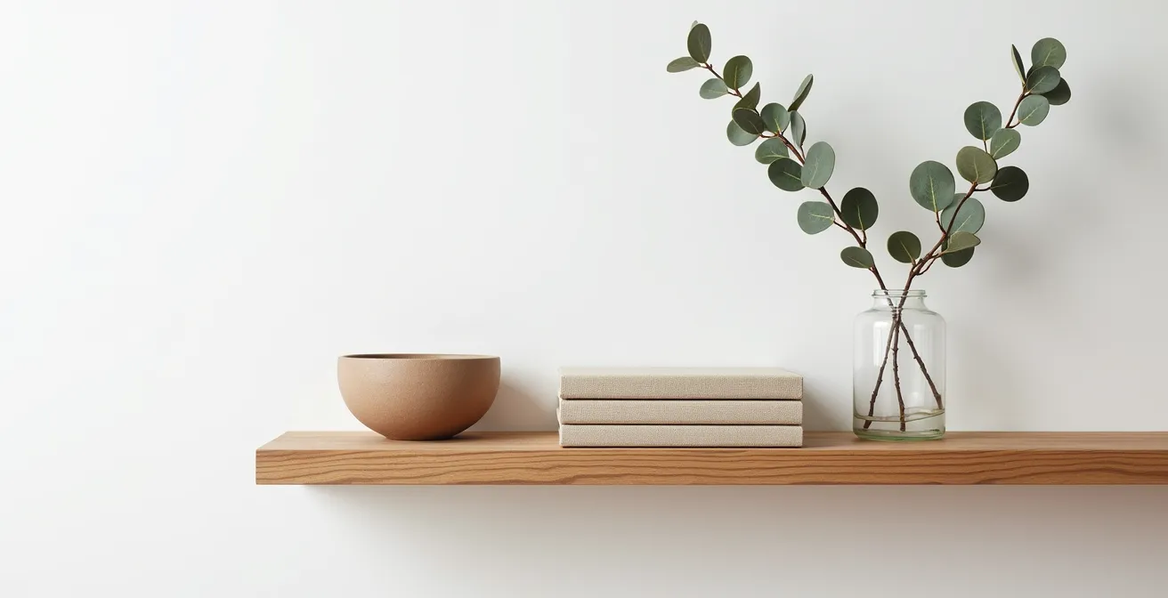
As you can see, the arrangement feels deliberate, not accidental. Here is a simple formula to replicate that stylist’s touch:
- 60% Books: They are the foundation. Don’t just stand them up; create short horizontal stacks to act as pedestals for other objects. Mix spine-out with spine-in (or even backward for a neutral, textured look) for variety.
- 30% Objects: This is where you inject personality. Use pieces with different heights and textures—think a smooth ceramic vase, a rough-edged wooden bowl, or a simple metallic sculpture.
- 10% Life: Add a touch of green with a small, easy-care plant like a succulent or a single branch in a vase. A personal photograph in a simple frame also works beautifully here.
- Crucial Negative Space: This is the most overlooked element. Leave 20-30% of your shelf surface completely empty. This “breathing room” is what prevents clutter and makes the entire composition feel sophisticated and calm.
By following this simple framework, you can transform any shelf from a cluttered storage space into a stylish, curated display that elevates your entire room.
Ash vs. Pine: Which Wood Tone Fits Your Color Palette?
Wood is the heart and soul of Scandinavian design, bringing in the warmth and natural connection that balances the style’s minimalist tendencies. But not all woods are created equal, and choosing the right tone is crucial for achieving an authentic look—especially on a budget. The high-end pieces you see in magazines often feature light woods like ash or white oak, known for their cool or neutral undertones. Budget-friendly options, however, are frequently made from pine, which has a distinctively warm, yellow, or orange hue.
Understanding the undertone of your wood is key to creating a cohesive color palette. Cool-toned woods like ash pair beautifully with crisp whites, soft blues, and dove greys, creating a serene and modern feel. Warm-toned pine, on the other hand, harmonizes better with creamy whites, beiges, and sage greens, fostering a cozier, more rustic atmosphere. Mixing these undertones without a clear strategy can make a space feel disjointed. The following table provides a quick guide to pairing wood tones with paint and textiles effectively, as highlighted by a recent comparative analysis of design elements.
| Wood Type | Undertones | Best Paint Colors | Complementary Textiles |
|---|---|---|---|
| Ash | Cool grey | Cool whites, soft blues, dove grey | Linen, wool in grey tones |
| Pine | Warm yellow/orange | Creamy whites, beige, sage green | Cotton, jute in warm neutrals |
| White Oak | Neutral beige | Both warm and cool whites | Any natural fiber |
But what if you love the cool Scandi look but are working with warm pine furniture? This is where a little budget alchemy comes in. You don’t need to buy new pieces; you can transform what you have. Here are a few thrifty techniques to shift the tone of your wood furniture:
- Apply a Wood Stain: Use a white or grey-tinted wood stain on your pine furniture. It will neutralize the yellow undertones and mimic the look of more expensive ash.
- Use Liming Wax: For woods with an open grain, liming wax can create a beautiful, soft, whitewashed finish that is quintessentially Scandinavian.
- Create a Paint Wash: Dilute your favorite neutral paint (1 part paint to 3 parts water) and apply it to your wood piece. It provides a subtle shift in color while allowing the natural grain to show through.
- Sand and Oil: If your piece has an old, yellowing varnish, simply sanding it down and treating it with a clear matte oil can reveal a much lighter, more natural tone underneath.
These simple tricks allow you to achieve a high-end, cohesive look without replacing your furniture, proving that a stylist’s eye is more valuable than a big budget.
The ‘All White’ Mistake That Makes Your Home Feel Like a Hospital
One of the most persistent myths about Scandinavian design is that it requires painting everything stark white. While a bright, light-reflecting palette is essential, a one-note white space can quickly feel sterile, cold, and devoid of personality—more like a clinical setting than a cozy home. The true art of the Nordic palette lies in its nuance, using subtle variations in shade and finish to create depth and warmth. It’s not about the absence of color, but the strategic and sophisticated use of neutrals.
A successful Scandinavian interior avoids flatness by layering different tones and textures of white. Think creamy off-whites, whites with a hint of grey, or warm, parchment-toned whites. This subtle variation prevents the space from feeling stark. Furthermore, grounding the light palette with strategic dark elements is a classic Nordic technique. As design experts often demonstrate, using a bold black stain on lower kitchen cabinets or an island can anchor an otherwise all-white kitchen, making the upper half feel even more light and ethereal. This contrast creates a smooth, sculptural effect and prevents the sterile feel.
You can achieve this professional-level depth on a budget by using a clever sheen strategy. Instead of using one type of paint, play with different finishes to create subtle visual interest that catches the light in different ways. This costs nothing extra but adds a layer of sophistication. Combine this with grounding elements to complete the look.
- Matte Walls: Paint your main walls in a warm white (with undertones between 2200K-2700K) with a flat or matte finish. This creates a soft, non-reflective base that feels calm and velvety.
- Satin Trim: Use the exact same white color but in an eggshell or satin finish for your trim, baseboards, and doors. This slight sheen will subtly catch the light and define the room’s architecture without introducing a new color.
- High-Gloss Accent: Add one or two small accents in a high-gloss finish. This could be a ceramic vase, a lacquered tray, or a metal lamp base. This “pop” of shine provides a focal point and adds a touch of glamour.
- Black Grounding Elements: Anchor your light space with thin, black metal elements. Think minimalist picture frames, the legs of a side table, or a simple floor lamp. This provides a graphic contrast that feels modern and intentional.
This layered approach to neutrals proves that a dynamic and inviting space is all in the details, not the color swatch.
Optimizing Hygge: Layering Blankets for Seasonal Comfort
If ‘lagom’ represents the balance of Scandinavian design, ‘hygge’ is its cozy, comforting soul. And nothing says hygge quite like a masterful layering of textiles. This isn’t just about throwing a blanket on the sofa; it’s a functional art form, a direct response to the long, cold Nordic winters. The ability to add or remove layers of warmth is a practical necessity that has evolved into a key aesthetic principle. It’s about creating a ‘thermal-adaptive’ environment that is as comfortable as it is beautiful.
The key to successful layering is creating a rich textural dialogue. Instead of using multiple blankets of the same material, mix them up to create a feast for the senses. The interplay between different textures—the smoothness of linen, the chunkiness of a cable-knit wool, the softness of faux fur or sheepskin—is what creates visual depth and an irresistible urge to curl up and get comfortable. This approach turns a simple chair or sofa corner into an inviting sanctuary.
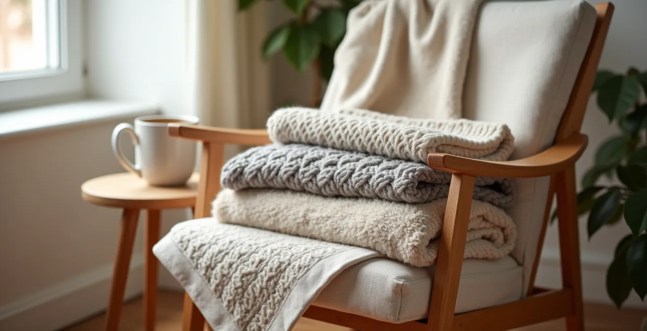
As the image above illustrates, the combination of different weights and weaves is what makes the arrangement so appealing. The concept of layering is fundamental to Scandinavian interior design, which was born in homes built to carry people through long, dim seasons. The abundance of textiles isn’t just a visual choice; it is a functional response that provides adaptable comfort. To create this look, you don’t need expensive throws. You can often find beautiful, textured blankets at thrift stores or budget-friendly home goods shops. Focus on a cohesive, neutral color palette—creams, oatmeals, soft greys, charcoals—and let the textures do the talking.
Start with a lighter base layer, like a linen or thin cotton throw, draped over the back of your chair or sofa. Add a thicker, more substantial middle layer, such as a chunky knit, folded neatly on the seat. Finally, finish with a super-soft top layer, like a faux sheepskin or a plush fleece, casually arranged for an effortlessly cozy look. This multi-layer system allows you to easily adjust your comfort level, embodying the perfect fusion of form and function.
By focusing on texture over brand names, you can create a deeply comfortable and visually rich space that feels both luxurious and genuinely livable.
How to Use Tactile Textures to Lower Your Heart Rate
The Scandinavian emphasis on natural textures goes far beyond aesthetics; it’s a powerful tool for well-being. In our digitally-saturated lives, we are often deprived of meaningful tactile experiences. Introducing a variety of natural textures into your home creates “touchpoints” that can ground you, reduce stress, and subtly improve your mood. The simple act of running your hand over a rough-hewn wooden bowl, feeling the coarse fibers of a jute rug underfoot, or sinking into a soft wool throw can have a real, physiological calming effect.
This connection between touch and tranquility is rooted in our biology. Engaging with natural materials can help regulate our nervous system. While overt clutter has been shown to increase stress, a thoughtfully curated environment rich in natural materials can have the opposite effect. Studies indicate that exposure to natural elements and textures can contribute to lower cortisol levels and improved mood regulation. By creating a multi-sensory experience, you turn your home from a place you simply look at into a place you truly feel and inhabit. This focus on sensory input is a key, yet often overlooked, component of creating a restorative home environment.
Integrating these tactile moments doesn’t require a big budget. It’s about being intentional with small details throughout your home. The goal is to sprinkle these sensory experiences along your daily paths, offering frequent, small moments of calm. A well-placed texture can serve as a physical anchor to the present moment, gently pulling you away from digital distractions and mental chatter. Use the following checklist to audit your own space and identify opportunities to weave in more calming textures.
Your Action Plan: Weaving Calm into Your Home
- Points of Contact: List all the high-traffic areas and common touchpoints in your home (e.g., entryways, work desk, kitchen counter, favorite armchair).
- Collect Existing Textures: Inventory your current textiles and objects. Do you have a smooth ceramic mug? A linen napkin? An unfinished wood cutting board?
- Check for Coherence: Compare your inventory to the Scandi palette. Are the textures natural (wool, jute, linen, wood, stone) vs. synthetic (polyester, plastic)? Prioritize the natural.
- Assess Sensory Variety: Are your current textures all smooth and similar, or is there a dialogue between rough, soft, cool, and warm? A mix is ideal for sensory richness.
- Plan for Integration: Identify gaps and plan small, budget-friendly additions. Swap a polyester throw for a cotton one, add a small sisal mat by the door, or find a smooth river stone for your desk.
This practice transforms your home into an active partner in your well-being, proving that true luxury is a feeling, not a price tag.
When to Purge Belongings: The 6-Month Usage Rule
A core tenet of achieving the Scandinavian look is decluttering, but the process can be paralyzing. The popular “6-month usage rule”—discarding anything you haven’t used in half a year—is often touted as a simple solution. However, this rigid, time-based rule can be ineffective. It fails to account for seasonal items, sentimental objects, or things you genuinely love but use infrequently. This can lead to decision fatigue, where the sheer volume of choices makes you give up altogether. The goal isn’t just to get rid of stuff, but to simplify your choices and regain control.
A more effective and less stressful approach, often used by professional organizers, is the “Container Concept.” Instead of focusing on time, this method focuses on space. Your home, your closet, your bookshelf—each is a container with a fixed capacity. The rule is simple: if the container is full, something must go before anything new can come in. This shifts the mindset from a constant, grueling purge to a simple, ongoing state of maintenance. It respects the physical limits of your space and forces you to make more conscious decisions about what truly deserves a place in your home.
But what about those items that break all the rules—the sentimental ones? The “Purgatory Box” method is a genius, low-pressure way to deal with them:
- Create the Box: Find a sturdy box and place any questionable sentimental items inside. These are the things you can’t bear to part with but aren’t actively using or displaying.
- Seal and Date: Seal the box and write today’s date clearly on the top.
- Store it Away: Place the box in an out-of-the-way location like a basement, attic, or the top of a closet. The key is that it’s not in your daily line of sight.
- Set a Reminder: Set a calendar reminder for one year from today.
- The Final Verdict: If you haven’t thought about or needed to open that box in a full year, it’s a strong sign that you can live without its contents. At that point, donate the entire box without re-opening it and re-living the difficult decisions. If you did retrieve an item, it has proven its value and earned its spot back in your home.
By adopting these smarter, more compassionate methods, you can conquer clutter for good, creating the calm, organized foundation your Scandinavian-style home needs.
Key Takeaways
- True Scandinavian style is built on the principle of “visual silence,” where intentional negative space creates more peace than an abundance of objects.
- The feeling of luxury comes from a rich dialogue between natural textures (wood, wool, linen) and a layered lighting strategy, not from expensive items.
- Intentionality is the ultimate form of budget luxury; every item should earn its place through function or joy, turning your home into a curated sanctuary.
How to Beat the Winter Blues With ‘Hygge’ Lighting Strategies
Lighting is arguably the most critical element in Scandinavian design, born from a need to combat long, dark winters. It’s about so much more than just illuminating a room; it’s about sculpting with light to create mood, depth, and a defense against the seasonal blues. The ‘hygge’ approach to lighting is not to flood a space with a single, bright overhead source, which creates harsh shadows and a flat, uninviting atmosphere. Instead, the goal is to create multiple pools of warm, gentle light throughout the room, mimicking the soft glow of candlelight or a fireplace.
The key to achieving this warm glow lies in the color temperature of your light bulbs. This is measured in Kelvin (K), and it’s a detail that professional designers never overlook. For a truly hygge ambiance, lighting experts recommend bulbs specifically rated between 2200K to 2700K. This range produces a warm, yellowish light that is much cozier and more flattering than the cool, blue-toned light of higher Kelvin bulbs (3000K+). This single, small change can have the most significant impact on the feel of your room.
Creating this layered lighting scheme doesn’t have to be expensive. It’s about being strategic with a few affordable sources. Here is a three-layer lighting strategy you can implement on a tight budget:
- Ambient Layer (Dimmer Switches): The cheapest and most effective upgrade is to install dimmer switches on your existing overhead lights. This gives you complete control over the overall light level, allowing you to dial it down for a cozy evening glow. This is a simple DIY task costing $15-30.
- Task Layer (Thrifted Lamps): Add a focused light source for activities like reading. A stylish floor or table lamp from a thrift store or flea market can add character and function for $20-40. Position it in a corner to create an inviting reading nook.
- Accent Layer (LED Strips & Multiple Bulbs): Use inexpensive, battery-powered LED strips under shelves or behind a headboard to create a soft, indirect accent light ($10-25). Instead of one bright bulb, use multiple lower-wattage bulbs (40-60 watt equivalent) in different fixtures at varying heights to create depth and eliminate flat shadows.
Start transforming your space today by choosing one room and applying these principles of light, texture, and intention. You’ll quickly discover that you don’t need a fortune to create a home that is serene, stylish, and deeply restorative.